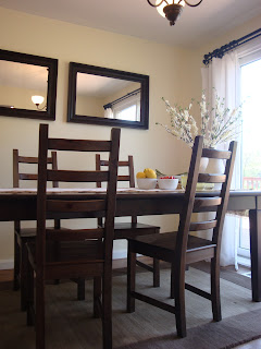
Decorating a Dining Room for Thanksgiving

After all of the decorations that I had up for Halloween, I wanted to keep the decorations that I put up for Thanksgiving pretty simple.  Especially considering that right around the corner is Christmas and I pretty much decorate every inch of my house with something.

For my centerpiece I decided to add some leaves and a simple pumpkin.  By placing the pumpkin on the wood accent, I have been able to create a more substantial piece for the eye.  I added the leaves to a clear vase to keep the table open.  When using a clear vase it doesn't block off the other side of the table, so it creates a more open centerpiece.


I love my chalkboard that I have hung in my dining room.  For awhile I was forgetting to utilize it, but since I have I really have been enjoying finding new things to write on it.  If this is something that you are interested in using in your house, Pinterest can be a great way to find sayings.  


I have added a wine rack to my dining room since I last posted about it.  It has become one of my favorite pieces in my entire home.  It adds such a warmth to my dining room and has really turned into a conversation piece.


I hope everyone is getting ready for the holidays, I know I am.

Welcoming Fall

Fall is here and I would like to share my front entrance with you.  I love decorating my front entrance for the seasons to create that warm welcome for people.  Currently it is decorated for Fall so that it works for Halloween to Christmas.


Right when you walk in the door you are greeted with a mirror.  To soften the look, I have put this wreath on the mirror using a clear command strip.  By using a command strip you can hide the hook so that you don't see any hardware.  By keeping my wreath generic, I can keep it up longer.


To keep my fall theme going, I have added some pumpkin accents as well.  By keeping the staple decorations on the dresser generic, I am able to accent with holiday and seasonal items very easily which I love to do.


With a few easy things, you can really warm up your entrance for guests through out the holidays.

Wall Art Over the Couch

Since we have renovated our family room, I have not had any luck finding artwork to go over our couch.  It's a pretty big size wall and couch so I needed to do something that would make an impact.  After shopping around with no luck, I decided to create my own wall art.  To do this, I needed to decide what size pictures that I wanted to hang.  I decided to do 8 x 10 pictures, because I wanted to be able to update them very easily.  Once I made that decision I could purchase my frames.  All of the frames that you see here are from Ikea.  After knowing the measurements of my frames, I could choose how many would best fit across the couch.


The next decision was to decide on the pictures that I wanted to frame.  Believe it or not this was the hardest part.  After long consideration, I chose the pictures and developed them in sepia tone so that the coloring in the picture didn't have to compete with my decorations.  Once you have your pictures framed, lay them out on the ground because you need to balance your pictures out.  Give consideration to what the subjects are and try to spread out like pictures.


This was such a fun project and I love being able to share my memories when people come over and visit.

Dressing Up a Light Fixture

Today I would like to share with you a quick and unique way of hiding the chain on your everyday light fixture.  I used a burlap cover in my dining room, but you could use any fabric.  You can make the fabric as tight or as loose as you desire.  With having a smaller section of chain, I didn't want to use too much fabric so I loosely wrapped the chain.  To secure the fabric together, you can use small buttons about an inch apart.  This is a very quick and easy project that you could do to dress up any light fixture.


Kitchen Series: Window Transformation

For the last day of my Kitchen Series, I have decided to share my window transformation with you.  To see what the window looked like before click here

I wanted to create a more open look to the window.  In order to do this I created a curtain that would open to let more of the window show.  To start, I found a fabric that would be light but also have a print on it.  The next thing that you have to do is decide on the length of the curtains.  Lastly, and to me the most important part are curtain rings.  Without them, your curtain will not hang as nicely and will not slide across the curtain rod as easily either.


I usually always leave the curtain open, but it is nice to have the ability to close the curtain as well.  It still keeps the window open, but also adds a little bit of privacy to your kitchen.


I hope you enjoyed my new Kitchen Series and as always if you have any questions, please email me.

Kitchen Series: A Decorating Extension

As you know, my kitchen is a little smaller.  With this, I have had to be a little more creative when planning out my kitchen decorating.  Our kitchen leads to our family room through this hallway that was always empty.  I couldn't extend the cabinets any further so instead I decided to add this hanging utensil decoration.  Adding this piece to the wall made the kitchen seem that much bigger.  It took your eye to a wall that was always ignored and now it has become a useful area.  If you are interested in creating this in your home, remember to keep whatever you decorate with slim to the wall.  The last thing you want to have is one more thing to maneuver around.  You don't have to use something like this either.  You could simply hang some decorative hooks on the wall and achieve the same look.


Not only did I create an extension to my kitchen, but this has become a very useful decoration to me.  With having my oven mitts so readily available it has been such a help with cooking.  It has also cleaned up some space in my drawers which everyone could use in a kitchen no matter the size.


Coming up next in the Kitchen Series is my window transformation!

Kitchen Series: Adding a Rug

I can't believe it took me this long to put a rug in front of my kitchen sink, but it did so don't judge me.  I know that a rug in that place is pretty much a staple, but it took me awhile to find one that I was really happy with.  I needed a rug that would flow with the kitchen and not be so big that it covered too much of the flooring.  After finding this rug at Target, I am amazed at the difference that it made to my kitchen.  Don't under estimate the warmth that a rug can bring.  It pulled the entire room together by having that piece on the floor.  Usually the color black can be a little too cold and modern for my home, but the texture and design on this rug fit my design perfectly.  So remember when you are out shopping to keep an open mind because you never know what you will fall in love with.


Kitchen Series: A Fresh Coat of Paint

Welcome to my new Kitchen Series!

As you recall, my husband and I completely renovated our kitchen from the ground up.  Since then, I have made a few minor changes that have dramatically changed the look of our kitchen.  I didn't think I could be happier with our space until I made these updates.  With my new kitchen series, you will be able to see all of the changes that I have made.  To remember what the kitchen looked like before click here

To kick off the series, I am unveiling my new paint color.  I loved the color before, but with a smaller kitchen and the updating that I have done in the rest of my home it needed a change also.  I have been painting some of the other rooms in my home to create a more clean, neutral look throughout so I wanted to continue that in my kitchen.  If you are interested in the paint color, email me and I can give you the details.  Don't be afraid to paint and try something new.


While I was updating the paint color, I also wanted to update my decorations/necessities to match the new look.  I wanted to keep the room very light and open.  In order to do this, I have used whites, creams, and natural coloring to keep the space unified.  With such a small space, you definitely need to keep the room cohesive, so that it doesn't give you a headache when you walk into the room.  


With keeping the room light and neutral, I can always switch out my dish towels whenever I like.  Currently I am sticking with my white and mustard yellow you could say.  


When storing those spoons, spatulas, whisks, and whatever else you have collected over the years, don't be afraid to try something a little more unique.


I hope you enjoy my new color as much as I do.  I love color, but there is something about that clean look that makes a space feel light and stress free.  Stay tuned for the rest of the Kitchen Series!

Decorating a Dining Room

Hello all!  
Today I am going to share my tips to decorating a dining room with you.  For my dining room, I used neutral colors so that I can decorate for any holiday or dinner party and have the entire room still flow nicely.  I used floor length white curtains on the sliding glass door, dark wood furniture, and a neutral brown rug to tie the room together.


To make the room appear larger, I added two of the same mirrors side by side to give the look that the room is wider than it is.  This is such a great tip for any small room.  It's also a great way to reflect light around the room.


I love having the chalkboard in my dining room.  I use this for holiday messages and dinner menus when having guests over.  To see how I created this chalkboard click here.


There are many different ways that you can decorate your table.  One of the ways you can decorate your table is with your dishes for the meal and drinks.  I have stacked up the plates on the chargers and placed them on the end of the table.  This is a much more informal way of having a meal.  I have also placed ready made drinks out with a pitcher.


We were so lucky to have this beautiful sliding glass door in our dining room.  The natural light it provides is great, plus it really opens up the room for us.  However, the hardware that came with the door was showing its age.  To see how I re-purposed the hardware to an oil rubbed bronze finish click here.


Our dining room table fits six people.  When having guests over, it is important to only have the amount of chairs out for the amount of guests you have.  You don't want to clutter the table with chairs that are not needed.  Your space will seem more open and clutter free without the extra chairs.  I have set the table for four so I simply removed the other two chairs.


 Thanks for checking out my dining room.  
If you are looking for more inspiration, check out the link below to see more dining rooms at Thrifty Decor Chick.

Family Room: Final Reveal

I have been sharing the process of completely renovating our family room with you and it's finally that time to show you the completed project.  I couldn't be happier with the way everything turned out.  The room is everything that I imagined it would be.  It's warm, cozy, and so comfortable to hang out in.  If you are having a hard time at remembering the before pictures click here.  I won't make you wait any longer, the suspense is over.  Enjoy the after pictures...


When I was deciding how I wanted the room to feel and look, I imagined neutrals and comfort.  I wanted the room to look great but feel very inviting.  To achieve this look, I kept the colors to cream, white, and brown, with a touch of red.  I added the touch of red so that the room wouldn't wash away.  It's nice to have that small hint of color.


It wasn't hard to achieve the look of comfort with the couch and chair that I picked out from PotteryBarn.  I realize it is not for everyone, but I have always wanted a couch and chair from PotteryBarn.  I love how comfortable they are and how nice they look.  They give such an inviting feel to a room.


When I was deciding on my furniture, I wanted to keep with my neutral color scheme.  One reason I love to keep my room neutral is so that I can change my accent color in and out without redecorating an entire room.  If I ever get tired of a color, all I have to change are a few pillows.


For now I am keeping the coffee table clear of decorations.  I like the clean look of the table now, but if I find that perfect piece I may place something on one side of the table and keep the other side clear.


One of my favorite pieces in this room is the media center.  I love the resemblance it has to a built in bookcase without it being permanent.  I find that bookcases can be a great display for decorations.  I love adding all of the personal touches to a room, but I don't like when it becomes too much.  With having all of the available decorating spaces on the shelves I was able to keep the decorating on my window table and fireplace to a minimum.


I wanted the decorations in the media center to be substantial yet fall into the background at the same time.  When I was decorating the media center, I had to remember that the purpose of the shelving unit is to hold our television, so I didn't want the decorations to over power that and be distracting.


You can see that I repeated a few of my decorations throughout the shelving.  I wanted to have continuity on both sides with a few differences.  I also added a little green by filling my glass jars with moss.  

When placing your decorations, try to balance your colors out.  You don't want one side to have all the light colors and the other side to be filled with all dark decorations.  Try to mix the light and dark with each shelf.  I also added the baskets to the shelves to tie in the rug and decorations from other rooms in my home.


When I was deciding how I wanted to decorate the other side of the room, I really liked the idea of having a long table under our new window.  I wanted that side of the room to tie in with the rest, but also have it's own purpose.  I love the combination of the dark table with the crisp, white curtains on both sides.


To have continuity throughout the room, I used the same candle holder on this table that I used in the media center.  I also used a large vase with the same finish to compliment the candle holder.  I chose to use green flowers because I did not want the flowers to directly match the colors of the room.  I wanted them to appear more natural and picked as opposed to matching the pillows.


I know I keep saying this, but this next picture is one of my favorites as well.  I added two of the same ottomans to go under my window table.  Not only do they give a unique look but you have two additional places for seating.  I really liked how the ottomans were not the typical shape as well as the fabric.  They match the style of the rest of the room without blending in too much.


I hope you enjoy my after pictures.  It was so much fun creating this room from start to finish and sharing the process with you.

Creating an Outdoor Room

I am so excited that it is time to start thinking about the outdoors!  I know it may seem early for some people, but the earlier you start planning your outdoor space, the more money you save.  By planning early you know what you are looking for so you can take your time and get the savings.  Plus, it also gives you time to complete all of the money saving DIY projects.

This year I have decided to create an outdoor living and dining area on our deck.  I love to be outdoors, but if it is not comfortable no one will want to hang out and stay.

Whenever I am deciding how I want to decorate a room, I always mark things in magazines and online so that I can get a good feel on how it will turn out.  By doing this I can change my mind and make changes without losing any money.

So that's exactly what I am currently doing with my outdoor plans.  The picture below is from the PotteryBarn magazine.  I love the simplicity of the black and white in this picture with the touches of greenery.


I have circled the black candle holders but this is something that I would not want to spend a lot of money on because my deck is not covered.  Anything that I put out will be exposed to the sun and rain damage.


In this picture I love how you have the mix of all of the different kinds of pillows.  It makes it look less formal and more inviting. 


This is one of my main focuses this year.  I love all of the different lanterns on the steps.  It looks great during the day plus it could serve as an added light at night by adding battery operated candles.


I'm not sure if I will try and recreate anything like the above picture but I really liked the idea of something hanging from the dining table umbrella so I marked it.  This is where you can take advantage of marking things you like.  You are not locked into any ideas.


Even though my backyard doesn't overlook the ocean, it doesn't mean that you can't bring the ocean to you.  I haven't decided how, but I would like to incorporate this beach feel to my backyard.  


I love all of these pitchers.  They are great for having company over because you can leave it outside plus it's nice if you are out doing yard work you don't have to be in and out of your house all day.

Now that I know what I would like my outdoor room to look and feel like I can begin to put it together.  I can't wait to show you the final project.
Related Posts Plugin for WordPress, Blogger...